Components
33 implemented component families. Targeting parity with shadcn/ui and daisyUI.
Primitives

Avatar
Initials display in a circle with deterministic background color derived from the initials.
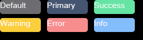
Badge
Status indicators and labels with Default, Primary, Success, Warning, Error, and Info variants.
Inputs

Button
Primary action element with three visual variants: Solid (filled), Outline (bordered), and Ghost (minimal).

Checkbox
Binary toggle for multi-select options with checked, unchecked, hover, and pressed states.

Radio
Single-select from a group of options with mutual exclusion.
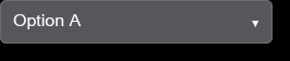
Select
Dropdown selection from a list of options with open/closed states.

Slider
Range input for numeric values within bounds with drag interaction.

Switch
Toggle between on and off states with on/off and hover visual states.

Text Input
Single-line text input with Normal and Masked (password) variants, focus handling, selection, and clipboard support.
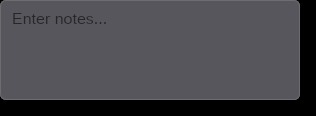
Textarea
Multi-line text input for longer content with focus and edit states.
Feedback
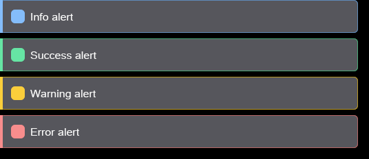
Alert
Status messages with Info, Success, Warning, and Error color variants. Optional closable affordance.

Progress
Determinate progress indicator showing completion percentage.

Skeleton
Loading placeholder content with Text, Card, and Circle shape variants.
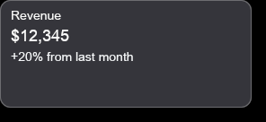
Stat
Title, value, and description display for key metrics and statistics.
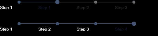
Steps
Sequential progress indicator showing current step in a multi-step flow.
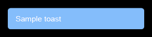
Toast
Non-blocking notifications with Info, Success, Warning, and Error variants. Supports click-to-dismiss; dismiss lifecycle is caller-owned.
Layout
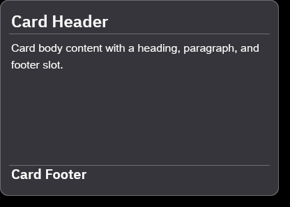
Card
Container for grouping related content with background, border, and corner radius.
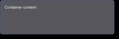
Container
Visual container that paints a caller-resolved rectangle with fill, border, corner radii, and optional shadow via BoxStyle.
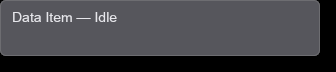
Data Item
Composable visual shell over caller-provided content with hover, press, and click state reporting.
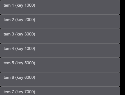
Data List
Fixed-height virtualized list scope with stable-key contract, visible-range rendering, and caller-owned scroll state.
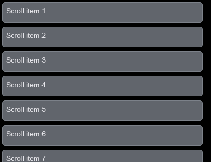
Scroll Area
Scrolling and clipping scope that clips overflow content to its bounds; scroll position is caller-owned, not retained by the component.
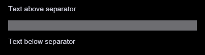
Separator
Visual dividers between content sections.
Overlay/Navigation
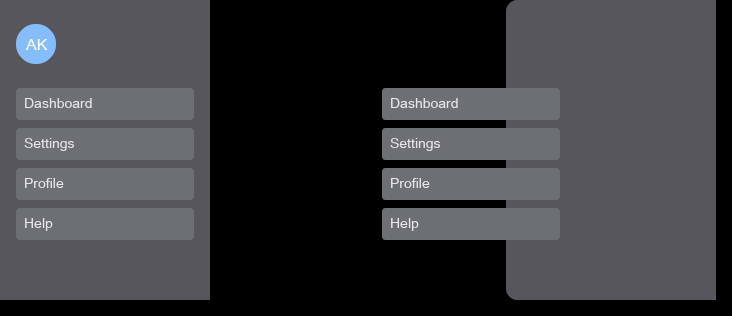
Drawer
Slide-in panel from screen edges with Left and Right edge variants.
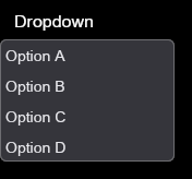
Dropdown
Context menu or action list triggered by a button or interaction.
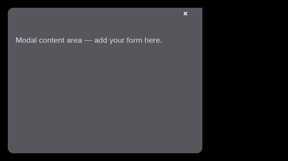
Modal
Dialog overlay for focused interactions with backdrop scrim.

Navbar
Top navigation bar with fixed start, center, and end layout slots.
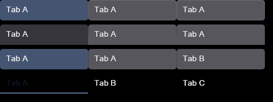
Tab Bar
Navigation between content panels with Boxed, Lifted, Pills, and Underline style variants.

Tooltip
Contextual information on hover with Top, Bottom, Left, and Right placement variants.
Typography

Heading
Section headings with H1 through H4 hierarchy levels and consistent styling.

Label
Text labels for form fields and UI elements.

Link
Navigation links with a hover underline state.
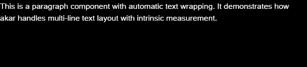
Paragraph
Body text with proper line height and spacing.
Special

Canvas
Continuous LOD rendering with world-space transforms, group-level interaction, and portal mode for interactive detail.
Roadmap
Coming next.
Components planned for future releases, derived from daisyUI and shadcn/ui parity analysis.
breadcrumbs
Hierarchical navigation trail; no akar equivalent yet
calendar
Date picker with month view; no akar equivalent yet
carousel
Image/content carousel; no akar equivalent yet
fileinput
File upload input; no akar equivalent yet
indicator
Positioned badge/dot indicator; no akar equivalent yet
kbd
Keyboard shortcut display; no akar component family yet
mask
Image mask/clip shapes; no akar equivalent yet
radialprogress
Circular progress indicator; no akar equivalent yet
rating
Star rating input; no akar equivalent yet
table
Structured data table; no akar component family yet
timeline
Vertical timeline display; no akar equivalent yet
accordion
Expandable content sections; no akar equivalent yet
aspect-ratio
Aspect ratio container; no akar equivalent yet
breadcrumb
Hierarchical navigation trail; no akar equivalent yet
combobox
Searchable dropdown with filtering; no akar equivalent yet
command
Command palette interface; no akar equivalent yet
context-menu
Right-click context menu; no akar equivalent yet
hover-card
Rich hover popup; no akar equivalent yet
input-otp
OTP code input; no akar equivalent yet
menubar
Application menu bar; no akar equivalent yet
navigation-menu
Navigation menu with submenus; no akar equivalent yet
pagination
Page navigation for lists; no akar equivalent yet
popover
Floating content triggered by interaction; no akar equivalent yet
resizable
Resizable panel layout; no akar equivalent yet
sidebar
Application sidebar navigation; no akar equivalent yet
spinner
Loading spinner; no akar component family yet
toggle-group
Group of toggle buttons; no akar equivalent yet
Crosswalk compared against local checkouts pinned at daisyUI 7238552d97fc and shadcn/ui 67cef8fcb94a.
Contributing
akar is open source. Contributions are welcome -- whether it's implementing a planned component, fixing a bug, or improving documentation.